Are you tired of sifting through massive spreadsheets, manually counting cells, or struggling to make sense of endless rows of data? Do you wish there was a magic button to instantly summarize your sales figures by region, analyze product performance, or track student grades without complex formulas? You’re not alone. Many office professionals and students face this exact challenge. The good news? There’s a powerful tool designed precisely for this: the pivot table. In this comprehensive guide, we’ll walk you through how to create a pivot table in Google Sheets, turning your raw data into actionable insights with just a few clicks. Get ready to transform your data analysis skills and unlock the full potential of your spreadsheets!
What Exactly is a Pivot Table? Your Data’s Personal Analyst
Imagine you’re managing a bustling bookstore. Every day, thousands of sales are recorded: which book was sold, to whom, on what date, at what price, and in which section of the store. If your manager suddenly asks, “Which genre sold the most books last month?” or “What’s the average price of a fiction book?” – going through each individual sale record would be a nightmare.
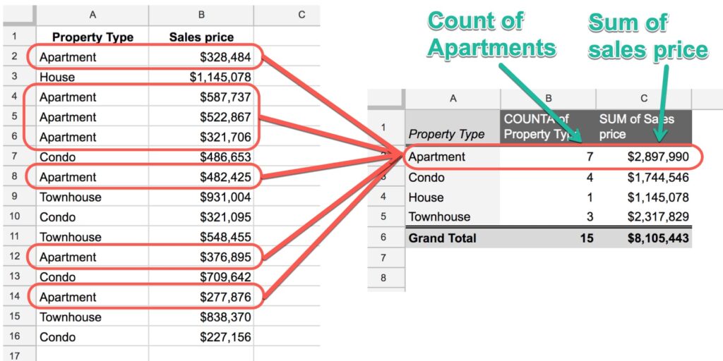
This is where a pivot table comes in. Think of it as your data’s personal, lightning-fast analyst. Instead of manually sorting, filtering, and summing, a pivot table automatically reorganizes, summarizes, and groups your data according to the criteria you set. It “pivots” (or rotates) your data, allowing you to look at it from different angles, revealing patterns, totals, and averages that were hidden in the raw information. It’s not just a fancy feature; it’s an indispensable tool for anyone who regularly works with spreadsheets.
Why Bother with a Pivot Table? The Power of Quick Insights
If you’re still wondering whether learning how to create a pivot table in Google Sheets is worth your time, let’s look at the compelling benefits:
- Rapid Data Summarization: Instantly aggregate vast amounts of data. Instead of writing complex
SUMIFSorCOUNTIFSformulas across multiple sheets, a pivot table does it in seconds. For instance, you can summarize total sales by product, month, or sales representative with incredible speed. - Easy Identification of Trends and Patterns: Quickly spot which products are top sellers, which regions are underperforming, or how specific marketing campaigns affected sales. This visual summarization helps you make sense of complex datasets.
- Flexible Reporting: Create multiple reports from the same source data without altering the original sheet. Need to see monthly sales by product, then immediately switch to quarterly sales by region? A pivot table lets you do this dynamically.
- Time-Saving: This is perhaps the biggest advantage. What might take hours of manual calculation and formula writing can be achieved in minutes, freeing you up for more analytical tasks rather than just data manipulation.
- Enhanced Decision-Making: By presenting data clearly and concisely, pivot tables empower you to make informed, data-driven decisions, whether you’re optimizing inventory, allocating resources, or strategizing for the next quarter.
Tip: Pivot tables are not just for sales data! They’re invaluable for tracking project progress, managing inventory, analyzing survey results, assessing financial records, or even organizing student grades. Any structured dataset can benefit.
Preparing Your Data: The Foundation for a Flawless Pivot Table
Before you learn how to create a pivot table in Google Sheets, it’s crucial to ensure your data is in good shape. A well-structured dataset is the secret to a smooth and accurate pivot table. Think of it as building a house – a strong foundation is key.
Here are the golden rules for preparing your source data:
- Header Row: Your data must have a single row of unique, descriptive headers at the very top. These headers (e.g.,
Date,Product Name,Region,Sales Amount,Units Sold) will become the “fields” you use in your pivot table. - No Blank Rows or Columns: Ensure there are no completely empty rows or columns within your data range. If Google Sheets encounters a blank row, it might assume that’s the end of your data.
- Consistent Data Types: Each column should contain only one type of data. For example, a
Sales Amountcolumn should only have numbers, aDatecolumn should only have dates, and aProductcolumn should only have text. Avoid mixing text and numbers in the same column if you intend to perform calculations on it. - No Merged Cells: Merged cells in your source data can cause issues with selecting ranges and how the pivot table interprets your data. Unmerge them before creating your pivot table.
- Unique Identifiers (Where Applicable): If you’re dealing with transactional data, ensure you have a way to distinguish between unique entries, even if not directly used in the pivot table itself.
Example Data:
Let’s assume we have the following sales data in Google Sheets, starting from cell A1:
| Date | Region | Product | Salesperson | Sales Amount | Units Sold |
|---|---|---|---|---|---|
| 2023-01-05 | East | Laptop | Alice | 1200 | 1 |
| 2023-01-05 | West | Mouse | Bob | 25 | 2 |
| 2023-01-06 | Central | Keyboard | Carol | 75 | 1 |
| 2023-01-06 | East | Monitor | Alice | 250 | 1 |
| 2023-01-07 | West | Laptop | Bob | 1100 | 1 |
| 2023-01-07 | Central | Mouse | David | 20 | 2 |
| 2023-01-08 | East | Keyboard | Carol | 80 | 1 |
| 2023-01-08 | West | Monitor | Bob | 240 | 1 |
| 2023-01-09 | Central | Laptop | David | 1150 | 1 |
| 2023-01-09 | East | Mouse | Alice | 30 | 3 |
This data is perfectly structured for a pivot table. Each column has a clear header, and the data types are consistent.
Step-by-Step: How to Create a Pivot Table in Google Sheets (The Core Tutorial)
Now that our data is prepared, let’s get down to business. Follow these simple steps to create your first pivot table in Google Sheets.
-
Select Your Source Data Range:
- Click on any cell within your data table. Google Sheets is usually smart enough to detect the entire contiguous range.
- Alternatively and for certainty, click on cell A1 (or the top-left cell of your data) and drag your mouse to select the entire table, including the headers. Or, use keyboard shortcuts:
Ctrl+A(Windows) orCmd+A(Mac) to select all data around your active cell. - For our example, select the range
A1:F11(orA1:F10if you don’t include the header). It’s always best to select all the data, including the headers.

-
Insert the Pivot Table:
- With your data selected, go to the Google Sheets menu bar at the top.
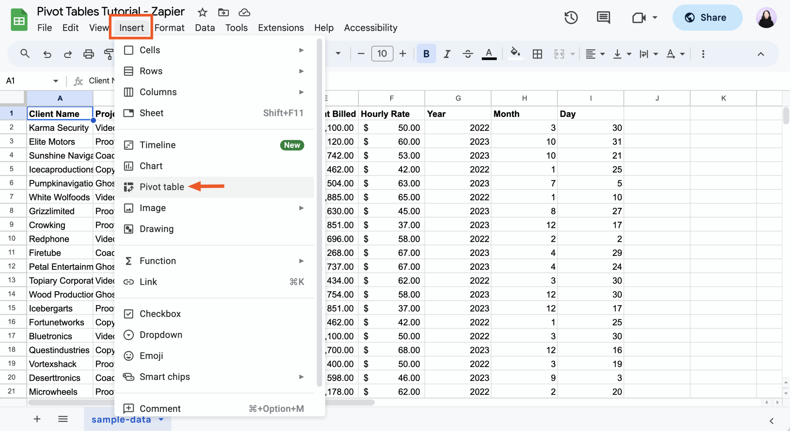
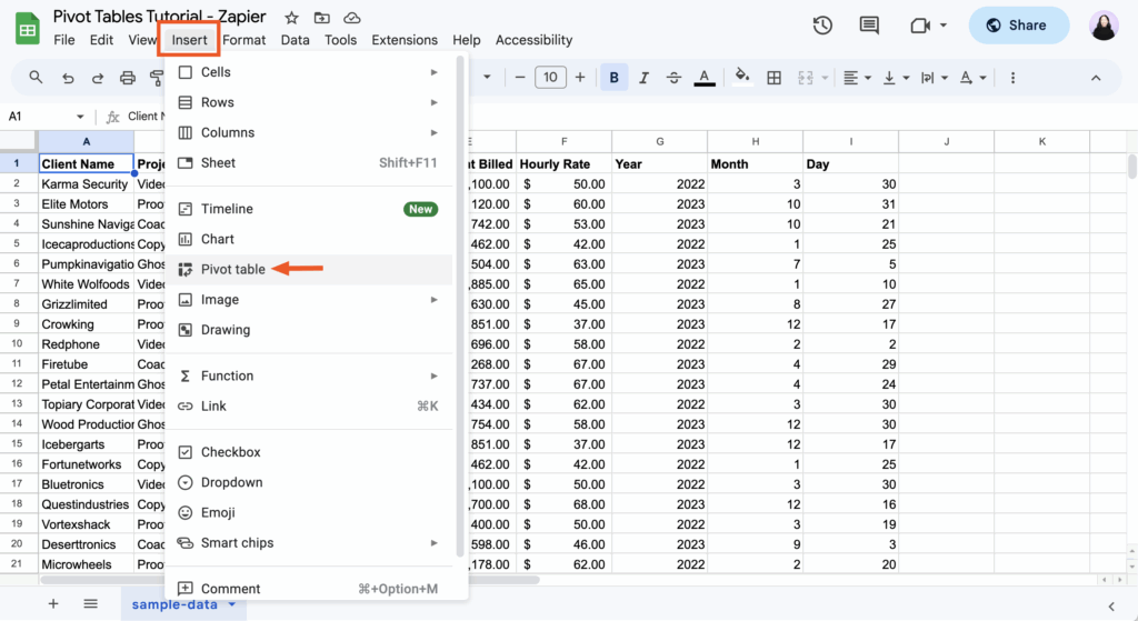
- Click on Data.
- From the dropdown menu, select Pivot table.
-
Choose Where to Create the Pivot Table:
- A small pop-up window will appear, asking “Create pivot table.”
- It will show “Select data range” – confirm that the range displayed is correct (e.g.,
'Sheet1'!A1:F11). - Under “Insert to:”, you have two options:
- New sheet: This is generally recommended as it keeps your original data clean and organized, placing the pivot table on its own dedicated sheet.
- Existing sheet: If you choose this, you’ll need to specify a starting cell where you want the pivot table to appear. Be careful not to overwrite existing data.
- For this tutorial, let’s select New sheet.
- Click Create.
Google Sheets will now open a new sheet (usually named “Pivot Table 1”) and display an empty pivot table canvas on the left, along with the “Pivot table editor” panel on the right side of your screen. This editor is where all the magic happens!
-
Understanding the Pivot Table Editor (The Control Panel):
This panel is your primary interface for building and customizing your pivot table. It consists of four main sections, each corresponding to a different “dimension” or “metric” you can add to your pivot table:- Rows: These are the categories you want to display down the left side of your pivot table. For example, if you add
Product, each unique product name will appear as a row. - Columns: Similar to Rows, but these categories will display across the top of your pivot table. Useful for adding a second dimension, like
RegionorMonth, to compare data side-by-side. - Values: This is the most crucial section. Here, you specify the numerical data you want to summarize (e.g.,
Sales Amount,Units Sold). You can choose how to aggregate these values (e.g., SUM, COUNT, AVERAGE, MAX, MIN). - Filters: This allows you to narrow down the data shown in your pivot table to specific criteria, just like a regular filter. For example, you could filter to only show sales from the
Eastregion.
- Rows: These are the categories you want to display down the left side of your pivot table. For example, if you add
-
Building Your First Pivot Table (Example: Total Sales by Product):
Let’s create a simple pivot table to see the total Sales Amount for each Product.
-
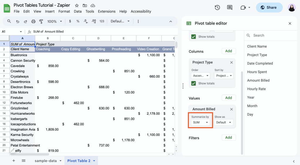
In the Pivot table editor panel on the right:
-
Next to Rows, click Add. From the list of available fields (your column headers), select Product. You’ll immediately see each unique product name appear in the first column of your pivot table on the left.
-
Next to Values, click Add. From the list, select Sales Amount.
-
By default, Google Sheets will usually use the
SUMaggregation. You’ll see “Summarize by: SUM” belowSales Amount. If you wanted a different calculation (like average sales), you could click on SUM and choose another option from the dropdown (e.g., AVERAGE, COUNT, MAX, MIN). -
You now have a clean summary! Your pivot table will show:
Row labels SUM of Sales Amount Keyboard 155 Laptop 3450 Monitor 490 Mouse 75 Grand Total 4170
-

Congratulations! You’ve just learned how to create a pivot table in Google Sheets and gained your first insightful summary from your raw data.
-
Customizing Your Pivot Table: Diving Deeper into the Editor
The true power of a pivot table lies in its flexibility. Let’s explore more options in the Pivot table editor to get deeper insights.
Changing “Summarize By” (Aggregation Type)
Instead of just SUM, you can analyze your Values data in many ways:
- Click on the field under Values (e.g.,
SUM of Sales Amount). - Under “Summarize by:”, click the dropdown and choose a different function:
- SUM: Adds up all the numbers (default for numerical data).
- COUNT: Counts the number of non-empty cells. Useful for counting transactions or unique occurrences.
- AVERAGE: Calculates the average of the numbers.
- MAX: Finds the largest number.
- MIN: Finds the smallest number.
- COUNTUNIQUE: Counts only the unique values in the range. (e.g., how many unique products were sold).
- STDEV / STDEVP: Standard Deviation (for statistical analysis).
Showing Values As… (Advanced Calculations)
This option allows you to display your values as a percentage of a total, which is incredibly useful for comparative analysis.
-
In the Values section, click on your value field (e.g.,
SUM of Sales Amount). -
Under “Show values as:”, click the dropdown.
-
Common options include:
- Default: Shows the raw aggregated value.
- % of grand total: Shows each value as a percentage of the overall grand total.
- % of row total: Shows each value as a percentage of its respective row’s total.
- % of column total: Shows each value as a percentage of its respective column’s total.
Example: If you wanted to see what percentage of total sales each product contributed, you’d choose
SUM of Sales Amountunder Values and set “Show values as:” to% of grand total.
Adding Multiple Fields to Rows, Columns, and Values
You’re not limited to one field per section.
- Multiple Rows:
- Under Rows, click Add again.
- Select another field, for example, Region.
- Now your pivot table will show
Regionas the primary grouping, withProductnested underneath, giving you sales by product within each region. You can drag and reorder the fields under Rows to change the hierarchy.
- Multiple Columns:
- Under Columns, click Add.
- Select Salesperson.
- Now, your pivot table will display product sales broken down by region (rows) and by salesperson (columns), creating a matrix.
- Multiple Values:
- Under Values, click Add again.
- Select Units Sold.
- Set its aggregation to
SUM. - Your pivot table will now show both the
SUM of Sales Amountand theSUM of Units Soldfor each combination of rows and columns.
Sorting and Filtering Your Pivot Table Data
-
Sorting:
- Under Rows or Columns, click on the field you want to sort (e.g.,
Product). - Under “Sort by:”, choose whether to sort by the
Productname itself (alphabetically) or by one of yourValuefields (e.g.,SUM of Sales Amount). - Choose
AscendingorDescending. This is incredibly useful for quickly finding top performers or lowest values.
- Under Rows or Columns, click on the field you want to sort (e.g.,
-
Filtering:
- Under Filters, click Add.
- Select a field, e.g., Region.
- Click the “Status” dropdown menu:
- Filter by condition: Use conditions like “Text contains,” “Is greater than,” etc.
- Filter by values: Uncheck the regions you don’t want to see, or select “Clear” then only check the ones you do want.
- Click OK. Your pivot table will instantly update to show only the filtered data.
Important Note: Filters in the pivot table editor only affect the pivot table output, not your original source data.
Advanced Pivot Table Techniques for Deeper Insights
Once you’re comfortable with the basics of how to create a pivot table in Google Sheets, you can unlock even more powerful features.
Grouping Dates (for Time-Series Analysis)
Analyzing data over time is a common task. Pivot tables make this effortless.
-
Assume you have a
Datefield in your source data. -
Add
Dateto the Rows or Columns section of your Pivot table editor. -
Right-click on any date cell within the pivot table itself.
-
From the context menu, hover over Create pivot date group.
-
You’ll see options like:
- Year
- Quarter
- Month
- Year-Quarter
- Year-Month
- Day of week
- … and more.
-
Select the desired grouping (e.g., Month). Your pivot table will instantly group all dates into their respective months, allowing you to easily see monthly totals, averages, or counts.

Calculated Fields: Creating New Metrics
Sometimes, the insights you need aren’t directly available in your source data, but can be derived from it. This is where Calculated Fields come in handy. For example, if you have Sales Amount and Cost of Goods Sold (COGS) in your data, you could create a Profit calculated field.
-
How to create a Calculated Field:
- In the Pivot table editor, under Values, click Add.
- Scroll down and select Calculated Field.
- A “Custom formula” box will appear. Here, you can write a formula using the names of your source data headers.
- Example: Let’s say we want to calculate a hypothetical commission of 10% on
Sales Amount.- In the “Custom formula” box, type:
= 'Sales Amount' * 0.10 - Be sure to put field names in single quotes if they contain spaces.
- In the “Custom formula” box, type:
- Rename the calculated field from “SUM of Custom formula” by clicking on it and typing “Commission” in the “Name” box.
- The pivot table will now display the calculated commission alongside your other values.
Important Note: Calculated fields operate on the aggregated values displayed in the pivot table, not on the individual rows of your source data. So,
'Sales Amount'in the formula refers to the sum of sales amount for that particular pivot table segment.
Slicers (Interactive Filtering)
While not strictly part of how to create a pivot table in Google Sheets‘s core functionality, slicers are an excellent companion for making your pivot table reports more interactive, especially for dashboards.
- Select your pivot table.
- Go to Data > Slicer.
- Choose the column you want to use for the slicer (e.g.,
Region). - A floating slicer object will appear. You can move and resize it.
- When you click on the slicer, you can select specific regions to filter your pivot table dynamically without opening the editor.
Common Errors and How to Fix Them
Even with the best preparation, you might encounter issues when you create a pivot table in Google Sheets. Here are some common problems and their solutions:
- “Error: Pivot table range is empty” or “No data to show”:
- Cause: Your selected data range is actually empty, or the filters you’ve applied are too restrictive.
- Fix: Double-check your initial data selection (
Data > Pivot table > Edit range). Also, review any filters in the Pivot table editor to ensure they aren’t excluding all your data.
- Incorrect Aggregations (e.g., Counting text instead of Summing numbers):
- Cause: The
Valuesfield is set to the wrong “Summarize by” option, or the source data in that column is not recognized as numerical (e.g., numbers stored as text). - Fix: In the Values section of the editor, click on the problematic field and change “Summarize by:” to the correct function (e.g.,
SUMorAVERAGE). If it’s still incorrect, go back to your source data and ensure the cells are formatted asNumber(Format > Number) and contain only numerical values. Remove any leading/trailing spaces or non-numeric characters.
- Cause: The
- Missing Headers in Pivot Table Fields:
- Cause: Your source data might be missing a header row, or Google Sheets didn’t detect it correctly.
- Fix: Ensure your very first row of data contains unique, descriptive headers. Recreate the pivot table after fixing the headers.
- Data Not Updating Automatically:
- Cause: While Google Sheets pivot tables are generally dynamic, sometimes for very large datasets or after significant changes (like adding entirely new columns to the source data outside the original range), a manual refresh might be needed, or the pivot table’s source data range needs to be updated.
- Fix: The simplest way to force a refresh is to make a minor change in the Pivot table editor (e.g., temporarily add and remove a field) or simply delete and recreate the pivot table if the source data range has expanded significantly. To change the source range, click the pivot table, then in the editor, click “Edit range” under “Data range.”
- Pivot Table Showing “Blank” as a Category:
- Cause: There are actual blank cells in your source data for the column you’ve added to Rows or Columns.
- Fix: Either clean your source data by filling in the blanks or, in the Pivot table editor, go to the
RowsorColumnsfield with “Blank”, click on “Status” below it, and uncheck “Blank” from the list of values to hide it.
Conclusion: Your Data, Demystified
Learning how to create a pivot table in Google Sheets is one of the most valuable skills you can acquire for data analysis. What once seemed like an insurmountable mountain of data can now be transformed into clear, concise, and actionable insights in mere minutes. We’ve covered everything from preparing your data to constructing your first pivot table, diving into customization options, exploring advanced techniques like grouping dates and calculated fields, and even troubleshooting common errors.
Remember, practice is key. The more you experiment with different fields in the Rows, Columns, Values, and Filters sections, the more intuitive the process will become. Embrace the power of the pivot table and let AskByteWise.com continue to simplify your tech journey!
Frequently Asked Questions (FAQ)
Q1: Can I refresh a pivot table in Google Sheets?
A1: Yes, pivot tables in Google Sheets are generally dynamic. If your source data changes (e.g., you update a Sales Amount for an existing entry), the pivot table usually updates automatically. If you add completely new rows or columns outside the original defined data range, you might need to manually update the source data range in the Pivot table editor (click the pivot table, then “Edit range” in the editor). Sometimes, a simple refresh (like temporarily adding and removing a field) can also force an update.
Q2: What’s the difference between Rows and Columns in a pivot table?
A2: Both Rows and Columns are used to categorize and group your data, acting as dimensions. The main difference is their layout: fields added to Rows will display their unique values vertically down the left side of your pivot table, while fields added to Columns will display their unique values horizontally across the top. Using both allows you to create a powerful two-dimensional matrix for comparison (e.g., Products as Rows and Regions as Columns).
Q3: How do I change the source data range for an existing pivot table?
A3: To change the source data range of an existing pivot table in Google Sheets, simply click anywhere inside your pivot table. The Pivot table editor will appear on the right. At the very top of the editor, under “Data range,” you’ll see the current range. Click on Edit range, then manually adjust the range or select the new range in your source sheet. Click OK or Create to apply the change.
Q4: Can I use formulas directly in a pivot table cell?
A4: No, you cannot directly type standard spreadsheet formulas (like =SUM(A1:A10)) into the cells of a pivot table output. The pivot table automatically generates its summaries. However, you can achieve similar results by using Calculated Fields within the Pivot table editor. These allow you to define custom formulas using your source data’s field names to create new metrics that are integrated into the pivot table’s calculations.
Q5: Can I sort the items within the Rows or Columns of my pivot table?
A5: Absolutely! In the Pivot table editor, under the Rows or Columns section for the field you want to sort, you’ll see a “Sort by:” dropdown menu. You can choose to sort by the field itself (e.g., alphabetically by Product name) or by one of your Values (e.g., SUM of Sales Amount) in either Ascending or Descending order. This is a very powerful feature for ranking and identifying trends.
See more: How to Create a Pivot Table in Google Sheets.
Discover: AskByteWise.