
Welcome, aspiring visual storytellers and digital artists, to AskByteWise.com! I’m Noah Evans, your guide through the fascinating world of digital creativity. Today, we’re diving into an essential skill that can transform good photos into great ones: color correction in Photoshop. Whether your image looks dull, has an unwanted color cast, or simply doesn’t pop, learning to manipulate its colors is a game-changer. This comprehensive A Beginner’s Guide to Color Correction in Photoshop will equip you with the knowledge and practical steps to bring out the true beauty in your images, making them vibrant, balanced, and professional. Get ready to turn washed-out photos into stunning masterpieces!
What You’ll Learn & Why It Matters
Imagine taking a beautiful photograph, only to find the colors look flat, the white balance is off, or there’s a strange tint over everything. Frustrating, right? This guide will show you how to systematically address these issues. We’ll explore powerful Photoshop tools that allow you to adjust exposure, contrast, color balance, and saturation with precision. By the end of this tutorial, you’ll be able to:
- Identify common color problems in images.
- Use Adjustment Layers for non-destructive editing, a cornerstone of professional workflow.
- Master core tools like Levels, Curves, Color Balance, and Hue/Saturation.
- Understand how to achieve accurate skin tones and vibrant landscapes.
- Apply your knowledge to make your photos look their absolute best, ready for sharing or printing.
Color correction isn’t just about fixing mistakes; it’s about enhancing mood, guiding the viewer’s eye, and perfecting your visual narrative. It’s a skill that elevates your work from amateur to polished.
Prerequisites for Your Color Correction Journey
To follow along with this guide, you’ll need:
- Adobe Photoshop: While specific versions might have minor interface differences, the core tools and techniques discussed are available in Adobe Photoshop CC (Creative Cloud) 2020 or newer. If you have an older version, most principles will still apply, but some menu items or panel layouts might vary slightly.
- Basic Photoshop Familiarity: You should be comfortable opening files, navigating the interface (panels, menus), and understand the concept of layers. Don’t worry if you’re a complete beginner; I’ll explain everything clearly.
- A Sample Image: Choose an image that you feel could benefit from some color correction. Something with a noticeable color cast, low contrast, or dull colors would be perfect for practice.
The Foundation: Non-Destructive Editing with Adjustment Layers
Before we dive into specific tools, let’s talk about the absolute most important concept in professional photo editing: non-destructive editing. This means making changes to your image without permanently altering the original pixel data. Why is this crucial for color correction in Photoshop?
Think of it like this: if you paint directly onto a masterpiece, you can’t easily undo or adjust that paint later without damaging the original. But if you paint on a transparent sheet placed over the masterpiece, you can remove, modify, or even replace that sheet anytime.
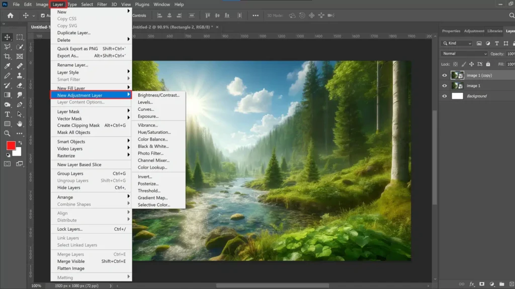
In Photoshop, Adjustment Layers are those transparent sheets. Instead of going to Image > Adjustments (which directly alters your pixels and is generally a no-go for professional work), we use the Adjustment Layers panel. Each adjustment layer applies a specific color or tonal correction effect above your image layer, without touching the original. This gives you immense flexibility:
- Editability: You can tweak any adjustment at any time.
- Flexibility: You can turn adjustments on/off, change their blending mode, or adjust their opacity.
- Control: Each adjustment layer comes with a built-in layer mask, allowing you to apply the effect only to specific areas of your image. We’ll touch on this later!
Always, always use Adjustment Layers for color correction and tonal adjustments. It’s the mark of an expert!
Step-by-Step: Your First Color Correction in Photoshop
Let’s roll up our sleeves and get practical. We’ll take a common image and walk through the process of basic color correction.
Step 1: Open Your Image & Get Organized
Our first step is to get your image into Photoshop and prepare your workspace.
- Open Your Image: Navigate to File > Open… (or press Ctrl+O / Cmd+O on Mac). Browse to your image file, select it, and click Open.
- Duplicate Your Background Layer: This is a crucial habit. With your image open, locate the Layers panel (usually on the right side of your screen). You’ll see a layer named “Background” with a lock icon. Press Ctrl+J (or Cmd+J on Mac) to duplicate this layer. Rename the new layer “Working Layer” (double-click the layer name to rename). This way, you always have your untouched original image safely tucked away.
Pro Tip: Always duplicate your background layer or convert it to a Smart Object before making any adjustments. This provides a safety net and allows for non-destructive transformations too.
Step 2: Understanding the Color Correction Workflow
While there’s no single “right” way to do color correction, a generally accepted workflow helps achieve the best results efficiently:
- Correct Exposure and Contrast: Start by making sure your image isn’t too dark or too bright and has good tonal separation. Tools like Levels and Curves are excellent for this.
- Adjust White Balance/Color Casts: Next, address any unwanted color tints. Is the image too blue, too yellow, or too green? Color Balance and Curves are fantastic here.
- Enhance Saturation and Vibrancy: Once the tones and overall color balance are good, you can selectively boost or reduce the intensity of colors using Hue/Saturation or Vibrance.
- Local Adjustments: Finally, if certain areas need specific tweaks, use layer masks to apply adjustments selectively.
We’ll follow this general order.
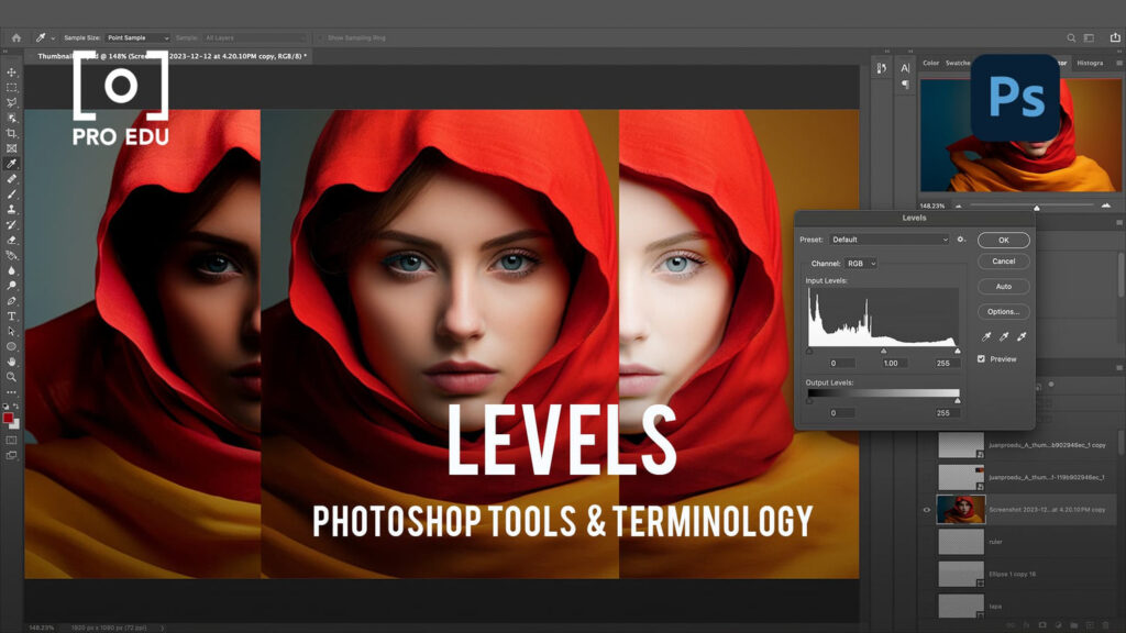
Step 3: Correcting Exposure & Contrast with Levels
Levels is a fundamental tool for adjusting the tonal range and contrast of an image. It helps define the brightest whites, darkest blacks, and mid-tones.
- Add a Levels Adjustment Layer: In the Layers panel, click on the Adjustment Layer icon (a half-filled circle) and select Levels. A new Levels adjustment layer will appear above your “Working Layer,” and the Properties panel will open, displaying the Levels histogram.
- Understand the Histogram: The histogram is a visual representation of the tonal distribution in your image. The left side represents shadows (dark tones), the right side represents highlights (bright tones), and the middle represents mid-tones. A gap at either end indicates a lack of true black or true white.
- Set Black and White Points: Below the histogram, you’ll see three sliders: black, gray, and white.
- Drag the black slider (leftmost) to the right until it meets the beginning of the histogram data. This sets your true black point.
- Drag the white slider (rightmost) to the left until it meets the end of the histogram data. This sets your true white point.
- You can also use the black and white eyedropper tools (small eyedropper icons in the Properties panel). Click the black eyedropper, then click on the darkest part of your image. Click the white eyedropper, then click on the brightest part of your image. Be careful not to pick a specular highlight (like a reflection) for the white point, or it might blow out details.
- Adjust Mid-tones (Gamma): The gray slider (middle) controls the mid-tones. Drag it to the left to lighten mid-tones or to the right to darken them. Adjust until your image has good overall brightness.
- Observe the Change: Toggle the visibility of the Levels adjustment layer (click the eye icon next to it in the Layers panel) to see the before and after effect. You’ll likely notice improved contrast and clarity.
Pro Tip: While adjusting the black and white points, hold down Alt (or Option on Mac) while dragging the sliders. For the black slider, this will show you clipped shadows (pure black areas). For the white slider, it will show clipped highlights (pure white areas). This helps prevent loss of detail.
*An example of the Levels Adjustment Layer panel in Photoshop, showing the histogram and input/output sliders for adjusting black point, white point, and mid-tones.*
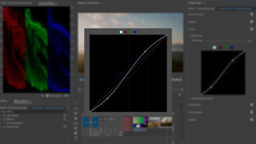
Step 4: Fine-Tuning Tones and Colors with Curves
Curves is arguably the most powerful tonal adjustment tool in Photoshop, offering unparalleled control over the entire tonal range and individual color channels.
- Add a Curves Adjustment Layer: Click the Adjustment Layer icon in the Layers panel and select Curves. The Properties panel will display a grid with a diagonal line.
- Understand the Curve: The diagonal line represents the original tonal values, while the curve you create represents the new tonal values. The bottom-left corner is pure black, and the top-right is pure white.
- Adjust Overall Contrast (S-Curve):
- Click on the curve approximately one-quarter of the way up from the bottom-left and drag it slightly down. This darkens the shadows.
- Click on the curve approximately one-quarter of the way down from the top-right and drag it slightly up. This brightens the highlights.
- You’ve just created an “S-curve,” which is a classic way to add contrast, deepening shadows and lifting highlights.
- Fine-Tune Brightness/Darkness: You can add multiple points to the curve and drag them to selectively lighten or darken specific tonal ranges. Drag a point up to lighten, down to darken.
- Adjust Individual Color Channels: This is where Curves truly shines for color correction.
- In the Properties panel, above the curve, click on the RGB dropdown menu and select a channel (e.g., Red, Green, or Blue).
- Adjusting the Red channel: Dragging the curve up adds red to your image (or removes cyan); dragging it down adds cyan (or removes red).
- Adjusting the Green channel: Dragging up adds green (removes magenta); dragging down adds magenta (removes green).
- Adjusting the Blue channel: Dragging up adds blue (removes yellow); dragging down adds yellow (removes blue).
- Use this to correct specific color casts. For example, if your image is too yellow, go to the Blue channel and drag the curve up slightly, especially in the mid-tones. If it’s too green, go to the Green channel and drag the curve down.
- Use the Targeted Adjustment Tool: This is a fantastic way to make intuitive adjustments. In the Properties panel for Curves, click on the Targeted Adjustment Tool (the hand icon with arrows). Now, click and drag directly on your image. Dragging up brightens the area you clicked; dragging down darkens it. If you have a color channel selected, it will adjust that specific color in the clicked area.
Note: Curves can feel intimidating at first, but practice makes perfect. Start with subtle S-curves and individual channel adjustments, and you’ll quickly get the hang of it.
Step 5: Adjusting Color Balance for Accurate Hues
Once you’ve set your overall exposure and contrast with Levels and Curves, Color Balance is your next go-to for fine-tuning the overall color cast of an image, especially for achieving accurate white balance or correcting specific tints.
- Add a Color Balance Adjustment Layer: Click the Adjustment Layer icon and select Color Balance.
- Understand the Sliders: In the Properties panel, you’ll see three sets of sliders, each with opposing colors:
- Cyan/Red
- Magenta/Green
- Yellow/Blue
- Dragging a slider towards one color will increase that color in the selected tonal range, while decreasing its opposite.
- Adjust Tonal Ranges: You can apply these adjustments to different tonal areas:
- Shadows: Select Shadows from the dropdown menu and adjust the sliders to remove or add color to the darkest parts of your image.
- Midtones: Select Midtones (often the most impactful for overall color correction) and adjust the sliders. This is where you’ll typically correct major color casts.
- Highlights: Select Highlights and adjust to fine-tune the brightest parts of your image.
- Correcting a Color Cast: Let’s say your image has a slight yellowish tint. You would go to Midtones, and drag the Yellow/Blue slider slightly towards Blue. If it’s too red, drag the Cyan/Red slider towards Cyan. Make subtle adjustments and observe the changes. The goal is a neutral look, especially in areas that should be white or gray.
Pro Tip: When adjusting Color Balance, pay close attention to neutral grays or whites in your image. If they look too warm or too cool, adjust the sliders until they appear neutral.
Step 6: Enhancing Specific Colors with Hue/Saturation
After you’ve perfected your tonal range and overall color balance, you might want to adjust the vibrancy or specific hues of certain colors. This is where Hue/Saturation comes in.
- Add a Hue/Saturation Adjustment Layer: Click the Adjustment Layer icon and select Hue/Saturation.
- Global Adjustments (Master): The default setting is Master.
- Hue: Shifts all colors around the color wheel. (Rarely used for general color correction, more for creative effects).
- Saturation: Increases or decreases the intensity/purity of all colors. Drag right to make colors more vivid, left to desaturate them (all the way left for grayscale).
- Lightness: Brightens or darkens all colors. (Often better controlled by Levels or Curves).
- Use the Saturation slider carefully to add a little pop without overdoing it.
- Targeted Color Adjustments: This is the most powerful feature of Hue/Saturation for color correction.
- Click the Master dropdown menu in the Properties panel. You’ll see individual color ranges like Reds, Yellows, Greens, Cyans, Blues, and Magentas.
- Select, for instance, Blues. Now, any adjustments you make to the Hue, Saturation, or Lightness sliders will only affect the blues in your image. This is fantastic for making skies deeper blue or cooling down warm shadows.
- Alternatively, use the Targeted Adjustment Tool (the hand icon) directly on your image. Click on a specific color (e.g., a green leaf), and then drag horizontally to adjust its hue or vertically to adjust its saturation.
- Below the sliders, you’ll see a color bar with two gray sliders. These define the range of colors being affected. You can drag these to precisely target your chosen color range.
- Before/After: Again, toggle the layer’s visibility to see the impact of your Hue/Saturation adjustments.
Note: Be subtle with saturation adjustments. Over-saturating an image can make it look unnatural and garish. A little goes a long way!
*The Hue/Saturation Adjustment Layer panel in Photoshop, showing the sliders for Hue, Saturation, Lightness, and the dropdown for selecting specific color channels.*
Step 7: Spot Corrections with the Brush Tool (Masking)
Sometimes, your color correction needs to be applied only to specific parts of your image. This is where layer masks come into play. Every Adjustment Layer automatically comes with a white layer mask thumbnail next to it in the Layers panel.
- White on the mask means the adjustment is 100% visible.
- Black on the mask means the adjustment is 100% hidden.
- Grays mean the adjustment is partially visible (opacity varies).
- Select the Mask: Click on the white mask thumbnail of any of your Adjustment Layers (e.g., the Levels layer). A white border will appear around it, indicating it’s selected.
- Select the Brush Tool: Press B on your keyboard or select the Brush Tool from the toolbar.
- Set Foreground Color: Ensure your foreground color is black (press D to reset colors to default, then X to swap foreground/background if needed).
- Paint to Conceal: With the Brush Tool and black as your foreground color, paint over the areas of your image where you don’t want the adjustment to apply. For example, if your Levels adjustment made someone’s face too dark, paint over their face on the Levels layer mask with a soft black brush.
- Paint to Reveal: If you’ve hidden too much, press X to switch your foreground color to white and paint over the areas to bring the adjustment back.
- Adjust Brush Opacity/Flow: You can reduce the Opacity or Flow of your brush (in the options bar at the top) to apply the mask effect more gradually, allowing for very subtle local color correction.
This technique gives you incredible control over where your color correction takes effect.
Step 8: Review & Refine Your Color Correction
You’ve applied several Adjustment Layers. Now it’s time to see how far you’ve come and make final tweaks.
- Toggle Visibility: Go to the Layers panel. Hold down Alt (or Option on Mac) and click the eye icon of your original “Background” layer. This will turn off the visibility of all other layers, showing you your original image. Click the eye icon again (still holding Alt/Option) to bring back all your adjustments. This is your “before and after” comparison.
- Adjust Opacity: Sometimes an adjustment is too strong. You can select an Adjustment Layer in the Layers panel and reduce its Opacity to lessen its effect.
- Reorder Layers: The order of Adjustment Layers can subtly affect the final look. Generally, tonal adjustments (Levels, Curves) come before color-specific ones (Color Balance, Hue/Saturation). Experiment by dragging layers up and down in the Layers panel.
- Save Your Work: Regularly save your project as a .PSD file (File > Save As…). This preserves all your layers and adjustments, allowing you to come back and make changes later. When you’re ready to share, save a copy as a .JPG or .PNG (File > Save a Copy…).
You’ve just completed a full round of color correction in Photoshop using professional, non-destructive techniques!
*A side-by-side comparison image, showing a “Before” version (original dull photo) and an “After” version (the same photo after applying the discussed color correction techniques in Photoshop, looking vibrant and balanced).*
Pro Tips for Better Color Correction in Photoshop
To truly master color correction, keep these advanced tips in mind:
- Calibrate Your Monitor: This is crucial! What you see on your screen might not be what others see, or what prints out, if your monitor isn’t calibrated. Invest in a monitor calibrator (like a Spyder or X-Rite device) for accurate color representation.
- Work in a Neutral Environment: Avoid working in rooms with strong colored walls or lighting, as this can trick your eyes into misinterpreting colors on your screen.
- Use Reference Images: If you’re aiming for a specific look or trying to match colors, have a reference image open beside your work. Your eyes are good at comparing.
- Don’t Overdo It: Subtle adjustments are usually best. The goal of color correction is often to make the image look natural and balanced, not overly stylized (unless that’s your creative intent!). When in doubt, dial back your adjustments slightly.
- Learn Keyboard Shortcuts: Speed up your workflow by memorizing common shortcuts (e.g., Ctrl+J for duplicate, B for brush, D/X for colors).
- Practice, Practice, Practice: The more you work with different images and explore the tools, the more intuitive color correction will become. Pay attention to how different colors interact and how changes in one adjustment layer affect others.
- Consider a Soft Proof: Before printing, use View > Proof Setup > Custom… to preview how your image will look on a specific printer/paper profile. This can highlight potential color shifts.
Wrapping Up Your Color Correction Journey
Congratulations! You’ve successfully navigated the core principles and powerful tools for A Beginner’s Guide to Color Correction in Photoshop. We started with an understanding of non-destructive editing using Adjustment Layers, then methodically addressed exposure and contrast with Levels and Curves. You learned how to tackle color casts with Color Balance and fine-tune specific hues with Hue/Saturation, all while gaining control with layer masks.
Remember, color correction is both a science and an art. The science is in understanding the tools; the art is in developing your eye for color and knowing when an image simply “feels right.” Keep experimenting, keep learning, and don’t be afraid to make mistakes – that’s how we grow! Your images will thank you for the extra attention to detail.
Frequently Asked Questions (FAQ)
Q1: What’s the main difference between Levels and Curves for color correction?
A1: Both Levels and Curves adjust tonal range and contrast, but Curves offers much finer control. Levels allows you to set the black point, white point, and mid-tone gamma across the entire image or individual RGB channels. Curves allows you to map any input tonal value to any output tonal value by adding multiple points to a graph, giving you precise control over specific tonal ranges (e.g., only brightening very dark shadows without affecting mid-tones). For overall contrast and basic white/black point adjustments, Levels is faster. For nuanced, targeted tonal and color adjustments, Curves is superior.
Q2: Should I use Image > Adjustments or Adjustment Layers for color correction?
A2: Always use Adjustment Layers! Using Image > Adjustments makes permanent, “destructive” changes to your image’s pixels. This means you can’t easily go back and edit them later without undoing many steps or starting over. Adjustment Layers, on the other hand, apply effects non-destructively, sitting on top of your image as editable layers. You can turn them on/off, change their opacity, edit their settings anytime, and even apply them to specific areas using layer masks. It’s the professional workflow for color correction in Photoshop.
Q3: How do I know if my colors are “correct”?
A3: This is subjective to an extent, but there are objective indicators. Check for:
- Neutral Grays/Whites: Areas that should be neutral (like a white wall or gray pavement) should not have an obvious color cast (e.g., too blue or too yellow). Use your Color Balance or Curves adjustment layers to target these.
- Skin Tones: Healthy skin tones fall within a specific range of hues. If they look too green, red, or magenta, your colors are likely off.
- Histograms: Your histogram (in Levels or Curves) should ideally touch both ends without being “clipped” (spiked at the edges), indicating a full tonal range.
- Reference: Compare your image to a known good image or a color checker (a physical card with standard colors). Ultimately, trust your eye, but train it with these objective checks.
Q4: Can I apply color correction to multiple images at once?
A4: Yes, you can! For a consistent look across a batch of photos, you can:
- Copy Adjustment Layers: Apply your Adjustment Layers to one image, then select all of them in the Layers panel, drag them to another open image file, or duplicate them onto another image from the Layer > Duplicate Layer… menu.
- Create a Preset: For many adjustments (like Levels or Curves), you can save your settings as a preset within the Properties panel. Then, apply that preset to other images’ adjustment layers.
- Actions: For a more complex, multi-step color correction workflow, record your process as a Photoshop Action (Window > Actions). You can then play this action on individual images or automate it for an entire folder using File > Automate > Batch….
Q5: What if my image looks different on another screen or when printed?
A5: This is a very common issue! The most frequent culprit is an uncalibrated monitor. Every screen displays colors slightly differently. To minimize discrepancies:
- Calibrate Your Monitor: Use a hardware calibrator (like X-Rite or Spyder) to create an accurate color profile for your display.
- Work in sRGB: For web and general sharing, sRGB is the most widely supported color profile. Ensure your images are converted to sRGB before saving for web (File > Export > Save for Web (Legacy)… will handle this, or File > Save a Copy… and select sRGB).
- Soft Proofing: If printing, ask your print lab for their ICC profile and use Photoshop’s Soft Proofing feature (View > Proof Setup > Custom…) to preview how the image will look with their specific printer/paper combination.
See more: A Beginner's Guide to Color Correction in Photoshop.
Discover: AskByteWise.